- Slider shows no connection to moving in depth!
- How would I know that I can multiple select the categories and drag them together?
- Presentation of the details/thumbnails not linked to the 'circular' concept!
- Is there any better transition/view of the selected category?
- Interface design does not tell me that I can actually drag & drop; more like only going in & out!
- What other ways can the sphere be split up?!
- Stronger reflection of the properties... youthful, creative, versatile, etc.
- TRY OUT MORE!
Tuesday, September 30, 2008
Further Amendments


Friday, September 12, 2008
Music Establishment (Suntec)
Date: Tuesday, 9th Sept. 2008
Time: 3:05PM


This store has a different style compared to HMV. It is very posh and elegant! In the store, all the large posters on the walls are framed up nicely with these huge golden-colored detailed frames. It’s very attractive. You know, the very royal kind of feeling.
They had chandeliers lightings in their store which made it even more poshy! One word – beautiful. It makes me feel extraordinary as a shopper inside that store. I would enter the store and not think that their stuff is expensive because I know that music albums are all around the same price everywhere and anywhere. Right? Okay, if they were selling stuff like clothing, I would not have entered the store. I bet their stuff would be very expensive.
I liked the way that they displayed their discs. Somehow, it’s very appealing and much better as compared to HMV. Why is that so? It’s very consistent and repetitive! All their discs are tilted sideways neatly in straight rows on the shelves. Another point is, they put more than one of the same discs in the same row. Repetition. It works! Very attractive indeed.
By JONG
HMV (CityLink Mall)
Date: Tuesday, 9th Sept. 2008
Time: 12:25PM


They have spotlights shining especially on their discs. They also have big clear section headings and numberings as well. This makes it easier to look at and the lightings make it visually appealing. They also hang up huge posters or CD album covers all over the walls of their stores. They stick their price tags on the top right side of the disc casings. The discs are also placed neatly in rows on the shelves, with the front facing the customers.
And normally, they put more than one of the same discs on the same row. There’s repetition. It attracts me more as compared to having just one disc. Maybe, it’s because of the repetition? Or the view of a bigger image as a whole?
Their listening stations have clear interface as well. It was easy to use and to trial listen to the discs available. Normally, they play happy/dance/popular/latest music in the background to attract the customers into their store. They also have TV screens playing music videos but there was no sound. And their TV screens were small. I thought that it was dumb.
They have a few different sections in the store itself; music, movies, magazines, and accessories. Their stuff is neatly sub-categorized as well. It makes it easy for anyone to find what they want.
I'll talk about Music Establishment in the next post. How is it different or as compared to HMV?
By JONG
Thursday, September 11, 2008
Trip to VivoCity on 10th Sept!
Date: Wednesday, 10th Sept. 2008
Time: 12:30PM
On 10th September, one of our group member Sin Yen went to VivoCity for the first time in her life. We wanted to observe how a shopper would navigate around the mall on his/her first visit, hence we decided to make Sin Yen our subject of observation.
Here's a breakdown on her navigation through VivoCity:
*Areas highlighted in Red = Areas Not Navigated*

Basement 2: She didn't explore the entire level, hence missing out on the VivoMart as well as the chain of light-food stalls. Generally first-time visitors would miss out on VivoMart, as its location is at the extreme end of the floor and is not visible at all to visitors, unless they chose to explore the entire level.

Level 1: She headed straight for the store directory and map right away. But on first look she gave up on the directory right away because it was "too confusing".

In the end she decided to explore the level on her own, and walked towards the right of the level. As she walked, she window-shopped rather aimlessly, not knowing where she would be heading towards. Then, she found this sleek computer which serves as a "Shop Finder Service".


But LOOK AT THE KEYBOARD. So filthy! No wonder we did not see anyone using the shop finder service. There was another computer with a cleaner keyboard, so Sin Yen used that computer instead. However it remains puzzling why the filthy keyboard was left in that state and not cleaned up, especially when VivoCity is so reputable and frequented by many tourists?

So Sin Yen attempted to find her directions using the service, but in the end she gave up too. "How can I use this service when it's my first time here and I don't know what shops are there here?"
It's believed that this service is for shoppers who came to VivoCity with a shop to frequent in mind, but not sure of its location. As this machine was situated near the back corner of the first floor, perhaps it was meant to help shoppers who were lost in their way as well and had just chanced upon this machine.


Level 2: After shopping for around half of the first floor, Sin Yen proceeded to the 2nd storey. She started to window-shop as she found stores that caught her attention. Most of the stores she visited were gift shops, which were clustered on the same side on Level 2.


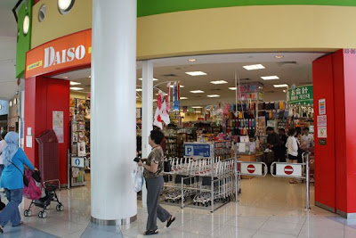
Level 3: After walking through half of level 2, Sin Yen decided to go up to Level 3 and have lunch at Food Republic. Then, she walked across the Sky Park and reached Daiso. She continued to spend time shopping within Daiso.
Then it was back to Level 2! However Sin Yen realised that she ended up walking back to the same places that she had already walked through previously, and in the end she gave up exploring and decided to go back to Level 1.
Soon after, she stopped and decided that she had seen enough of VivoCity. She was aware that she had not completed walking through the mall, but she gave up exploring as she didn't know where else she could walk towards.
Conclusion:
First-time visitors may feel lost as there are no clear directions, nor were the directory/shop finder service helpful at all. The layout of the mall also proved to be difficult to understand for first-time visitors, as very often they will walk back to the same spot that they had already walked past previously. Much could be improved on their direction-aids.
Read post below for Sin Yen's personal recount of her first shopping experience in VivoCity!
By Chun Kiat
Time: 12:30PM
On 10th September, one of our group member Sin Yen went to VivoCity for the first time in her life. We wanted to observe how a shopper would navigate around the mall on his/her first visit, hence we decided to make Sin Yen our subject of observation.
Here's a breakdown on her navigation through VivoCity:
*Areas highlighted in Red = Areas Not Navigated*

Basement 2: She didn't explore the entire level, hence missing out on the VivoMart as well as the chain of light-food stalls. Generally first-time visitors would miss out on VivoMart, as its location is at the extreme end of the floor and is not visible at all to visitors, unless they chose to explore the entire level.

Level 1: She headed straight for the store directory and map right away. But on first look she gave up on the directory right away because it was "too confusing".

In the end she decided to explore the level on her own, and walked towards the right of the level. As she walked, she window-shopped rather aimlessly, not knowing where she would be heading towards. Then, she found this sleek computer which serves as a "Shop Finder Service".


But LOOK AT THE KEYBOARD. So filthy! No wonder we did not see anyone using the shop finder service. There was another computer with a cleaner keyboard, so Sin Yen used that computer instead. However it remains puzzling why the filthy keyboard was left in that state and not cleaned up, especially when VivoCity is so reputable and frequented by many tourists?

So Sin Yen attempted to find her directions using the service, but in the end she gave up too. "How can I use this service when it's my first time here and I don't know what shops are there here?"
It's believed that this service is for shoppers who came to VivoCity with a shop to frequent in mind, but not sure of its location. As this machine was situated near the back corner of the first floor, perhaps it was meant to help shoppers who were lost in their way as well and had just chanced upon this machine.


Level 2: After shopping for around half of the first floor, Sin Yen proceeded to the 2nd storey. She started to window-shop as she found stores that caught her attention. Most of the stores she visited were gift shops, which were clustered on the same side on Level 2.


Level 3: After walking through half of level 2, Sin Yen decided to go up to Level 3 and have lunch at Food Republic. Then, she walked across the Sky Park and reached Daiso. She continued to spend time shopping within Daiso.
Then it was back to Level 2! However Sin Yen realised that she ended up walking back to the same places that she had already walked through previously, and in the end she gave up exploring and decided to go back to Level 1.
Soon after, she stopped and decided that she had seen enough of VivoCity. She was aware that she had not completed walking through the mall, but she gave up exploring as she didn't know where else she could walk towards.
Conclusion:
First-time visitors may feel lost as there are no clear directions, nor were the directory/shop finder service helpful at all. The layout of the mall also proved to be difficult to understand for first-time visitors, as very often they will walk back to the same spot that they had already walked past previously. Much could be improved on their direction-aids.
Read post below for Sin Yen's personal recount of her first shopping experience in VivoCity!
By Chun Kiat
Going to VivoCity
Date: Wednesday, 10th Sept. 2008
This is my 1st time going to vivo city, so it’s a very good chance for my group members to experiment.
When I first went into the shopping centre, I feel a bit lost, as in I don’t know where to start, and as I keep on walking in I do know where to go and how to move on. I did see the directory thing but I think it doesn’t help me a lot I still don't know what kind of shops they have in this shopping centre. Then I decided to move on by myself, when I moved on to level 2 I keep walking to the same place, and this makes me feel very tired and feel like leaving the place.
I think they should put same sign board to direct the shopper from moving on. Just like what IKEA did for their shoppers. They used arrows and maps to direct their shoppers and this makes their shoppers feel comfortable shopping at their place. Another example is the Singapore Zoo, we always know where we are and what we are looking at using the maps given and the signboards.
By SinYen
Calvin Kelvin Underwear
Date: Tuesday, 9th Sept. 2008
Time: 2:00PM
Shopper went in to the shop looking for thing he wanted, but seems like he is lost. He stood in front of the drawers for quite sometime, not knowing what he is looking for, he gazed the overall and started to walk around the shop. After awhile he still feel lost and went out of the shop.

He doesn't know that the drawers can be pull out.
I think we always have this problem when we are doing our shopping, when information is not clear or when we feel lost in the shop we will leave the place. I think it’s the same thing in the virtual world, we tend to leave the website or application when we don't know what's going on.
By SinYen
Video Ezy
Why would I choose Video Ezy instead of the other rental stores in Singapore?
· Action & Adventure
· Animation
· Asian
· Children & Family
· Classics
· Comedy
· Documentary
· Drama
· Horror
· International
· Music & Musicals
· Romance
· Sci-Fi & Fantasy
· Sports
· Thrillers
· TV Series
Basically, they have three main sections. They are the latest/new releases, by genre and by alphabetical order.
About their layout/display, I liked the corporate identity that they have. They used the blue and orange complimentary colors effectively. They also have huge movie posters/advertisements all around their stores which brightens up the whole environment and it also serves as an attraction. They have a relatively huge TV screen playing the most recent movie at the moment with their sound blasting out. This is another way to attract customers into their stores as well.
Video Ezy:
· More appealing (in terms of their design/visuals)
· Trustable
· More accessible (many outlets all around Singapore)
Others:
· Dull looking
· Old; which gives me the feeling of being not updated
· Not appealing
However, both have FREE membership registration! That’s what I am concerned about most.
Alright, I’ll talk about what they have in their stores.
· New Releases (1-Day Rental)
· Popular Rentals (Recommendations)
· Special Promotions
· Others such as;
- Popcorns
- Ben & Jerry’s Ice Cream
- Potato Chips
- Movie Toys Collectibles
· Action & Adventure
· Animation
· Asian
· Children & Family
· Classics
· Comedy
· Documentary
· Drama
· Horror
· International
· Music & Musicals
· Romance
· Sci-Fi & Fantasy
· Sports
· Thrillers
· TV Series
Basically, they have three main sections. They are the latest/new releases, by genre and by alphabetical order.
About their layout/display, I liked the corporate identity that they have. They used the blue and orange complimentary colors effectively. They also have huge movie posters/advertisements all around their stores which brightens up the whole environment and it also serves as an attraction. They have a relatively huge TV screen playing the most recent movie at the moment with their sound blasting out. This is another way to attract customers into their stores as well.
I also liked the fact that they do not only sell or rent out movies, but also other related items such as popcorns and potato chips! It gives us the things that we need for a wholly and enjoyable movie experience at home, don’t you think so?
In the store, they have neat rows/shelves of the movies with big clear headings (e.g. popular, new releases…) at the top. The DVD cases are displayed with their front faced towards the customers. However, not for all, only those popular and new releases movie rentals.
In the store, they have neat rows/shelves of the movies with big clear headings (e.g. popular, new releases…) at the top. The DVD cases are displayed with their front faced towards the customers. However, not for all, only those popular and new releases movie rentals.
On the other hand, the other movie rental stores categorize their movies in a clear holder file for the customers to look through. They do not have recommendations or any indication of the latest movie. I didn’t liked the idea of having to flip and view the choice of movies that they have from a file, because first of all, I would have to flip through and look through all of them one by one. After flipping and seeing so many of them, it kind of makes me feel messy and confused somehow. And by putting them all in a file, I couldn’t do comparisons as effectively. I would need to flip and flip again to compare. If they are all being displayed out for me on the shelves, it would have been easier.
Another point is that, those neighborhood movie rental stores are mostly popular with those aunties or housewives. Why is that so? Because they focus more on those Chinese TV series which they liked. And they have a much more extensive database of those Chinese drama TV series as compared to Video Ezy.
By JONG
Monday, September 8, 2008
NTUC FairPrice (Woodlands Civic Centre)
Date: Friday, 5th Sept. 2008
Time: 1:00PM


On first sight, we saw the colorful fruits/vegetables section. Same as Cold Storage. However, I had the feeling of not knowing where to start first. It appeared to me as messy and overwhelming as they had narrow walking space and low ceiling and I disliked their lightings. It’s not that the supermarket is poorly lighted, but it’s just not as appealing as compared to the Cold Storage. Perhaps, the lightings are more focused on the products in Cold Storage? And there’s more crowd compared to the crowd in Cold Storage. That means I need to squeeze with the other shoppers in the supermarket.
Talking about the crowd, what I noticed is that they are mostly from the middle income group. You know, those aunties and all. And after reading the corporate information of the NTUC FairPrice, they stated that “its founding mission to help moderate the cost of living for low income households in Singapore remains at the heart of its operations”. So, it’s true!
There are clear section headings/signs all around the supermarket as well. However, I noticed that they do not use colors to differentiate their sections. Same as Cold Storage.
They also place the smaller items at the top and the bigger items at the bottom of the shelves. Same as Cold Storage.
In NTUC, the products were not fully stocked up. So, there were a lot of empty spaces that we see which were not appealing though it also means that there were a lot of buyers in this supermarket.
The layout and the outlook of the whole supermarket gave the impression that their stuff is cheaper compared to Cold Storage. Perhaps, this has to do with the human mindset. If you see a well decorated/furnished store, what comes to your mind? “Oh my, their stuff wouldn’t be cheap I guess.” Would you still wish to enter the store? However, it also depends on the people that we see in the store as well. If there is a crowd, we’ll definitely be attracted to it. You know, Singaporeans are like that.
If you ask me to choose between Cold Storage and NTUC FairPrice, I would choose NTUC FairPrice. Why is that so? Because I feel that they ‘care’ more for customers like me. Yes, I am very cautious with my money. And I would get more benefits if I shop in NTUC FairPrice as compared to Cold Storage. There are additional services such as linkpoints, fairplus plus credit card etc. I would love that as I shop regularly in supermarkets to get my necessities and stuff.
That’s about it.
By JONG
Cold Storage (Causeway Point)
Date: Friday, 5th Sept. 2008
Time: 11:30AM


On first sight, we saw the colorful fruits/vegetables section. They appeared bright and fresh which looked appealingly enough to attract the customers to enter. That’s what I think. You know, bright colors make us cheerful?

Their items are neatly placed and fully stocked up. The items are placed upright as well. They placed their items in a way that the front packaging of the product is facing the customers when they look at it. You wouldn’t want to see the barcode of the product right?
Most of the times, they place the smaller items at the top of the shelves and the bigger items at the bottom. Why? That’s common sense! It’s easier to take right? Let’s say if you need to buy a crate of drinks and it’s placed right at the top of the shelves… it might just fall on you while you are trying to take it down and that would be dangerous. Yes, very dangerous!
There are clear section headings/signs all around the supermarket as well. However, I noticed that they do not use colors to differentiate their sections.
They have big clear pricings of the products as well.
They have huge walking space for the customers as well. You wouldn’t like to squeeze with the other shoppers too right? Think of the huge trolleys and the accessibility.


Sometimes, a certain product may have been displayed at more than one location in the supermarket. What do I mean by that? Take for example, the Oreo! It was seen in the dairy/milk section as well as in the cookie/cereal section. They do place matching products together as well to further promote it. Like, milk goes with cookies.
Another point that I feel is, it’s good having a huge walking space and that the related products are closely grouped together on the shelves (with no space in between). Why? This is because it allows me to be able to stand back and take a look at the ‘whole picture’. It is easier for me to refer and to do comparisons with the pricings and stuff.
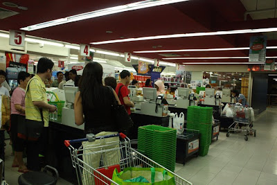
At the cashier area, while the customers are waiting in queue, that’s when their eyes start to look around and wander… and what we normally see near the cashier area are products such as sweets, batteries, magazines, medication (panadol) and condoms etc. Sometimes, we don’t really need them, but we’ll just buy them when we see it right?
Another point is that, after you make your payment and walking out of the cashier, most of the times we are greeted by those one-dollar coin machines. You know, those cute little toys stuffed inside the capsule thing. Yes, I think that it is because after making payment, most of us normally would get back some loose change and that’s why they placed those machines there. Kids love it.
I'll continue about the NTUC Fairprice in the next entry.
By JONG
Time: 11:30AM


On first sight, we saw the colorful fruits/vegetables section. They appeared bright and fresh which looked appealingly enough to attract the customers to enter. That’s what I think. You know, bright colors make us cheerful?

Their items are neatly placed and fully stocked up. The items are placed upright as well. They placed their items in a way that the front packaging of the product is facing the customers when they look at it. You wouldn’t want to see the barcode of the product right?
Most of the times, they place the smaller items at the top of the shelves and the bigger items at the bottom. Why? That’s common sense! It’s easier to take right? Let’s say if you need to buy a crate of drinks and it’s placed right at the top of the shelves… it might just fall on you while you are trying to take it down and that would be dangerous. Yes, very dangerous!
There are clear section headings/signs all around the supermarket as well. However, I noticed that they do not use colors to differentiate their sections.
They have big clear pricings of the products as well.
They have huge walking space for the customers as well. You wouldn’t like to squeeze with the other shoppers too right? Think of the huge trolleys and the accessibility.


Sometimes, a certain product may have been displayed at more than one location in the supermarket. What do I mean by that? Take for example, the Oreo! It was seen in the dairy/milk section as well as in the cookie/cereal section. They do place matching products together as well to further promote it. Like, milk goes with cookies.
Another point that I feel is, it’s good having a huge walking space and that the related products are closely grouped together on the shelves (with no space in between). Why? This is because it allows me to be able to stand back and take a look at the ‘whole picture’. It is easier for me to refer and to do comparisons with the pricings and stuff.
At the cashier area, while the customers are waiting in queue, that’s when their eyes start to look around and wander… and what we normally see near the cashier area are products such as sweets, batteries, magazines, medication (panadol) and condoms etc. Sometimes, we don’t really need them, but we’ll just buy them when we see it right?
Another point is that, after you make your payment and walking out of the cashier, most of the times we are greeted by those one-dollar coin machines. You know, those cute little toys stuffed inside the capsule thing. Yes, I think that it is because after making payment, most of us normally would get back some loose change and that’s why they placed those machines there. Kids love it.
I'll continue about the NTUC Fairprice in the next entry.
By JONG
Data Visualization

We came across this interesting website.
http://msnbcmedia.msn.com/i/msnbc/components/spectra/index.html
The Spectra Visual Newsreader grabs MSNBC stories, color-coded by category, and sends them flying around your screen like index cards in a wind tunnel. Maybe you don't want to get your news this way all the time, but it's fun to play with.
By JONG
What Attracts My Attention Most?


I normally go to shops which have things arranged neatly and tidy... or shops which sell things that I want to buy.
What affects me from entering the shop?
- sales person
- prices
- small little hanging items that will make me want to have a closer look
- colours
- interesting displays
By SinYen
Subscribe to:
Posts (Atom)