Stacked Bar Chart
This view displays all points from different series, but with the same argument, stacked in a single bar. (For instance, this is useful to show that each bar represents a particular category.) So, the height of each bar is determined by the total of all the series values for the category.
Credits: DevExpress
We can make use of different colour legends to differentiate our categories. The choice of colours can also represent a certain value, such as the number of views/popularity. (E.g. The more popular a particular category is, the more bright and saturated its colour will be?)
The X-Axis value in the above picture represents a timeline. We can use that too. Otherwise, it can even be used to represent each main category. The coloured bars are sub-categories. Possible?
The Y-Axis value of the bars can also represent various values. It can be the number of views/visits, number of works, number of awards, and many more. Users must be able to understand the value it represents and also the meaning behind it, which should cater to the users' preferences and needs.
By Chun Kiat
Wednesday, October 29, 2008
Tuesday, October 28, 2008
Monday, October 27, 2008
Interface Design 1
Sunday, October 26, 2008
Saturday, October 25, 2008
TO DO LIST
Things To Be Done:
Site Dynamism
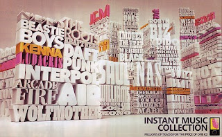
Inteface Design - How to visualize data using Stacked Typography?
Dummy Prototype
Sat-Sun:
Come up with sketches/mockups of interface design
Show how user navigates
Monday:
Compile over MSN, early afternoon
Finalise interface design
Tues-Wed:
Start on the graphics and scripting
Thursday:
Apply both the graphics and scripting
Debugging
Friday:
Presentation
Stacked Typography:
1) Height
2) Color
3) Size
What does these three layers of information stands for?
How do we fit in categories and works into our typography concept?
Objective: Leave behind a strong impression of what our course is about, and why students should join our course.
Message: IxD is the course to join for a future in Interaction Design.
Interaction Design:
-Provide engaging experience with interface for users
-Delivers message efficiently across
-Improves convenience for users
-Close gap between virtual and reality
-Connects human network
In short,
Interaction Design --> Communication
What To Consider:
-Visualize Data
-Maintenance
-How to include tags, search functions, etc.
JIAYOU!
By Chun Kiat
Friday, October 24, 2008
Sorting Exercise
Wednesday, October 22, 2008
Tuesday, October 21, 2008
3D Typography
Monday, October 20, 2008
Updates!
What Users Look For:
- What is this course about
- Why should I join this course
- Is this course good enough for me
- What will I learn from this course
- What lies ahead in my future if I join this course
- How good are they compared to other courses
Users Want Interface To Be:
- Clear, Simple and easy to understand
- Easy to navigate around, won't get lost
- No slow loading time
- Able to find information required directly
- Better layout + graphics than other similar courses?
Concept:
Magazine Layout
Why?
Newspapers/Magazines have an interesting way of getting their message across, thru their different layouts, the way they emphasize on their headlines, and attract users to read their contents. If not, then why are some newspapers and magazines more popular than some others?
E.g. Why does so many ppl like to buy The New Paper as compared to other choices like Straits Times, Today, etc? Why did TNP change their interface treatment recently? It's so as to attract more readers and inject a different experience for readers when reading news.
Magazines have similar effects with their cover page, as the way how they arrange their cover page layout will help them gain an edge over competitors. Magazine contents are also carefully planned to make sure that readers stay hooked to the magazine and even find it worth subscribing to.
E.g. Compare Lime Magazine to Teenage Magazine, or Cleo as compared to other female magazines... what makes them stand out? Even though it's just words and pictures, you can always sense an attitude in the magazines. And that's the kind of attitude I hope we can express too, to attract the similar target audience.
Personal Opinions:
Our target audience is teenagers, and I feel that they would be attracted to a pop style treatment to our interface. There's also a good reason why teens love magazines like Lime, Teenage, and prefers to read TNP than other newspapers...
And one good reason why we chose to make use of typography is because it sends both a Visual and Verbal message to our intended audience. Hence, thru a newsletter layout, we can emphasize on our contents through LOUD, CLEAR and EXPRESSIVE "headlines", and inject a certain attitude into our interface.
Whether this will turn out to be boring or interesting depends on how well we can express our attitude through the words we use, and how interesting our layout can be as well. We must look into what makes teenage magazines successful, and how they keep teenagers hooked to their contents.
That's what I came up with for now. Hope this helps. =)
By Chun Kiat
Stand Up or 2D
Flags as Infographics
Sunday, October 19, 2008
Sorting Information
Traditional Media
Illustration
Packaging
Photography
Prints
Interactive Media
Browser-Based Design
Non-Browser-Based Design
Mobile Design
Installation Design
Designer/Developer Collaboration
Video & Motion
Motion Graphics
Miscellaneous
We listed it out this way is because I think that if we break it down to too many categories like (e.g. advertising, corporate, brand identity, information kiosks) it may be a bit messy and there will be too many things to sort, and what if there's only one or two works in that category? So, we listed out four main categories and some sub-categories. However, the naming of the categories might not be familiar to our target audience.
By SinYen
Take Note!
Consultation
- Play with the word 'INTERACT'
- IxD (Interaction Design)
- Black, White & Red
- Dynamism
Visualizing Information!
List down all the possible types of works under Interactive Media.
- How can we categorise them?
- Why is it in this way?
- Does our target audience understand?
- Is it what they want to see? What do they want to see?
By JONG
Type Interface
Subscribe to:
Posts (Atom)